Office Odyssey
A branching workplace simulation for inclusion, accessibility, and service equity training
The Problem With Most DEI Training
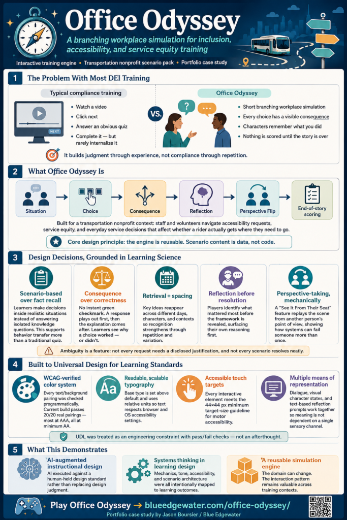
Most compliance-driven learning follows the same pattern: watch a video, click next, answer an obvious quiz question. Learners complete it. They rarely internalize it.
Office Odyssey replaces that pattern with something closer to how judgment actually gets built: a short, branching workplace simulation where every choice has a visible consequence, every character remembers what you did, and nothing is scored until the story is over.
The MVP scenario pack was built for a transportation nonprofit context — staff and volunteers navigating accessibility requests, service equity, and the everyday decisions that determine whether a rider actually gets where they need to go. The underlying engine is domain-agnostic by design; the scenario content is data, not code.
Design Decisions, and the Learning Science Behind Them
Every mechanic in this build maps to a specific instructional principle — not decoration, a deliberate choice.
Scenario-based over fact recall. The player never answers a multiple-choice question about a concept. They make a decision inside a situation, the same way judgment actually gets exercised on the job. This is the difference between recognizing the right answer and producing it under realistic conditions — closer to what Kirkpatrick’s Level 3 (Behavior) actually measures than a knowledge-check ever gets.
Consequence over correctness. There is no green checkmark. A choice plays out through dialogue and a relationship shift, then the explanation comes after — never before. Telling someone a response is wrong teaches compliance. Letting them watch it land wrong, then explaining why, teaches transfer.
Retrieval and spacing, not a single pass. The same underlying concepts (assumption vs. accommodation, dignity vs. curiosity, individual behavior vs. systemic policy) reappear across different days and different characters rather than being taught once and dropped. Recognition strengthens with repetition in a new context — a core finding from retrieval-practice and spaced-repetition research, applied at the content-architecture level.
Reflection before resolution. Every scenario asks the player what mattered most before revealing the “correct” framing — a deliberate structural choice to surface the player’s own reasoning first, rather than replacing it with an authoritative answer immediately.
Perspective-taking, mechanically. A dedicated “See It From Their Seat” mechanic lets the player replay a moment from a coworker’s point of view — not as a hint, but as its own scene. In the flagship example, a quiet employee’s contribution gets talked over in a morning huddle; the flip reveals she had already raised the same issue through the proper channel earlier that morning, and been ignored there too. The lesson isn’t “notice quieter people” — it’s that the system’s response failed her twice, not once.
Ambiguity as a feature, not a bug. Several scenarios are deliberately unresolved — a rider’s unexplained standing request, a reason someone won’t disclose. The design principle: not every accommodation needs a justification, and building a game where every situation resolves cleanly would quietly teach the opposite lesson. Real dignity-respecting practice tolerates not knowing why.
Built to Universal Design for Learning Standards
Accessibility wasn’t a pass at the end — it shaped the build from the token layer up.
- Color system, engineered, not eyeballed. Every text/background pairing in the shipped UI was verified programmatically against WCAG contrast thresholds — not estimated by eye. The build includes a permanent contrast-checking tool in the codebase, currently passing 20/20 real pairings, most at AAA (7:1+), all at minimum AA (4.5:1).
- Typography that respects the learner, not just the designer. Base type sizes were deliberately set above default (18px equivalent) and built on relative units so text scales with a learner’s own browser or OS accessibility settings — not fixed to a designer’s assumption of “normal” vision.
- Touch targets sized for motor accessibility. Every interactive element meets the 44×44px minimum target-size guideline — a frequently-skipped detail in web-based training that matters directly for learners with motor-control differences.
- Multiple means of representation. Dialogue, visual character states, and text-based reflection prompts work together rather than requiring any single sensory channel to carry the full meaning of a scene.
This is UDL treated as an engineering constraint with a pass/fail check, not a values statement.
What This Demonstrates
Office Odyssey is a working example of AI-augmented instructional design — not AI replacing design judgment, but AI executing a spec while a human instructional designer holds the standard.
Every stage of this build (engine architecture, content generation, accessibility compliance, deployment) was scoped, reviewed, and verified in sequence — content checked for tone and dignity before being approved, accessibility checked against real contrast math before being called done, mechanics checked against actual gameplay before being shipped. The build log reads like a design review, because that’s what it was.
Thanks for your review and considering me to become a part of your instructional design team!
Built by Jason Boursier, MS Learning Design & Technology (Purdue University) — AI Learning Manager & Instructional Design Consultant.